Wednesday, May 11, 2016
Color Harmony Rules
Art in America
November 2015 p 7
This is a complimentary color composition. It uses two colors that are on opposite sides of the color wheel
Color Harmony Rules
Art News
Summer 2015 p 101
The colors blue, green, and brown and on the color wheel in three different positions which we refers to as being Triadic.
Asymmetrical Balance
Artfurom International
Summer 2015 p 91
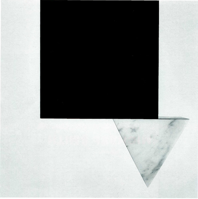
This piece is clearly an asymmetrical piece because of the position of the triangle.
Color Harmony Rules
Art in America
November 2015 p 84
This is a monochromatic piece. It uses different variations os blue.
Color Discord
Artforum International
Summer 2015
I chose this a an illustration of color discord because it doesn't represent any of the color harmony rules. The colors are all over the place.b
Balance
Balance
Front Cover p 115
Color Harmony Rules
Analogous
The Design of Dissent
The color harmony rule in this image is analogous. It uses colors red, yellow and green which are all next to each other on the color wheel.
Depth By Perspective
Depth by Perspective
Century of Graphic Design p. 103
The winding if the roads in the background give the illusion of depth by perspective. Also the mountains in the background gives an illusion that they are not only far away but still hugh.
Depth By Value
Depth By Value
Century of Graphics p115
I think this is a perfect example of depth by value. Although the color values are not monochromatic, the variations to the colors allows you to get a different perspective of its contents.
Creativity
Creativity
Graphic Design Annual 2014
I chose this as an illustration of Creativity because of the connection between brain power and all the subject matters of the objects portrayed.
Tuesday, March 1, 2016
Depth
Athena Reproductions
Graphics Poster 74
Page 211
This composition has a copious amount of depth to it. From the initial view through a peep hole to the crevasses in the mountains and to the actual positions of the mountains. Not only is this depth by perception but it is depth by size and shadow as well..
John Boucher
Graphic Poster 85
Page 51
I chose this piece because I think it illustrates a perfect example of depth by perspective and depth by shadow. The top of the picture gives the illusion that the title Tecno is farther behind the image itself.
Tuesday, February 9, 2016
Rhythm
Eric Cai Design Co.
Graphic Posters Annual '08/'09
Page 50
I chose this picture because I think it illustrated rhythm in a profound way. The darker blue as a color choice gives this composition more harmony and unity which are held together by small rectangles.
Walter Ballmer
Graphic Posters 74
Page 42
The variations of the symmetrical rhythm projected in this composition is indeed busy. I thought this piece exudes not only rhythm but depth as well.
Thursday, February 4, 2016
Radial Balance
Studio8 Design
Graphics Poster Annual '08/'09
Page 71
The balance in this composition I believe is considered to be "Radial Balance" Everything is not only centered onto the canvas but reflected upon both sides.
Wednesday, January 27, 2016
Unity
Blatner Brunner
Graphics Poster Annual '08/'09
Page 189
What better way to show unity be lighting up the place. Although their are many different variations of lighters the consistency of the "type" of lighters used allows this composition to maintain its unity. They used music, peace signs, and the dragon from a Chinese parade to exude unity in this composition.
Pomegrante
Graphic Poster 74
Page 220
The black and white stripes in this composition exhibits unity. The artist presents us with images of zebras within the black and white stripes.
Chaotic
Steven Tabbutt
Society of Illustrators
Page 480
The artist creates this perception he calls "Kingdom". I chose this picture because the content in itself is chaotic. The background has a lot of energy in it. Mischief is happening everywhere. Although this image is chaotic it has a unity in it. The bear and the elephant portrait strong animals who are no match for the insects with stingers.
Subscribe to:
Comments (Atom)


