Wednesday, May 11, 2016
Color Harmony Rules
Art in America
November 2015 p 7
This is a complimentary color composition. It uses two colors that are on opposite sides of the color wheel
Color Harmony Rules
Art News
Summer 2015 p 101
The colors blue, green, and brown and on the color wheel in three different positions which we refers to as being Triadic.
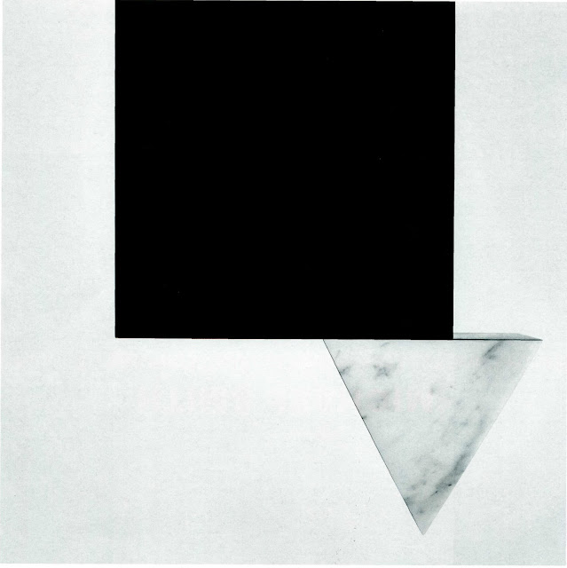
Asymmetrical Balance
Artfurom International
Summer 2015 p 91
This piece is clearly an asymmetrical piece because of the position of the triangle.
Color Harmony Rules
Art in America
November 2015 p 84
This is a monochromatic piece. It uses different variations os blue.
Color Discord
Artforum International
Summer 2015
I chose this a an illustration of color discord because it doesn't represent any of the color harmony rules. The colors are all over the place.b
Balance
Balance
Front Cover p 115
Color Harmony Rules
Analogous
The Design of Dissent
The color harmony rule in this image is analogous. It uses colors red, yellow and green which are all next to each other on the color wheel.
Depth By Perspective
Depth by Perspective
Century of Graphic Design p. 103
The winding if the roads in the background give the illusion of depth by perspective. Also the mountains in the background gives an illusion that they are not only far away but still hugh.
Depth By Value
Depth By Value
Century of Graphics p115
I think this is a perfect example of depth by value. Although the color values are not monochromatic, the variations to the colors allows you to get a different perspective of its contents.
Creativity
Creativity
Graphic Design Annual 2014
I chose this as an illustration of Creativity because of the connection between brain power and all the subject matters of the objects portrayed.
Subscribe to:
Posts (Atom)


